Các kiến thức cần ghi nhớ trong việc thiết kế Design System
...
Lý thuyết:
A design system is a series of components that can be reused in different combinations. Design systems allow you to manage design at scale. Example:
- Lego: How many ways can you combine six 2×4 LEGO® bricks of the same color? → 915,103,765 different ways!
- Taco Bell: 8 ingredients = 50+ Menu Options
Another name: Design System = Atomic Design = Design Language = Modular Design = Component Design
Why should you use a Design System?

- Save time and Money: Scale - Consistency - Efficiency - Teamwork
- Design Systems are the future
Style Guides, Pattern Libraries, Design Systems

Atomic Design Process:


Atomic design: how to design systems of components
Nowadays, digital products must be able to exist across any and all devices, screen sizes, and mediums at the same time:

So why the hell are we still designing our products by “page” or by screen?! → Instead, we should be creating beautiful and easy access to content, regardless of device, screen size or context.
How is this different than before?


Everything starts with the brand identity

Enrich the system - Think generic
.jpeg?version=1&modificationDate=1552551451234&cacheVersion=1&api=v2&height=250)

The part and the whole - Mutualize the work


Share the system
.jpeg?version=1&modificationDate=1552551902695&cacheVersion=1&api=v2&height=250)

Three golden rules for great architecture:
- Durability (Firmatis ): The building should be robust and remain in good condition.
- Utility (Utilitas): The building should be functional and useful for the people who are in it.
- Beauty (Venustatis): The building should be delightful and soulful.
Design principles:
- Human layer: To create a design system you must understand the rules that humans live by, and by rules we could also call these restrictions or limitations.
- Conventions layer: Every system needs a set of common conventions to help with users learning the ability. Human beings do not like change, so creating a set of consistent rules will help them understand what they need to do.
- Branding layer: This is where the visual style, beauty, and personality of your design system shines. The branding layer helps your system create a standard that is visually distinct and recognizable.
Shopify’s Polaris Design System is one of the best examples. On the homepage, they’ve already broken down all the core sections:
- Product principles – What is the purpose and soul behind all the products?
- Written content – How should the product’s interface copy look and feel?
- Visual properties – What should the “skin” of the product look and feel like?
- Components – What are the UI patterns and code components needed to build products coherently across devices?
Atomic Design & creativity:
When you really find your own interpretation on how to use Atomic Design, you can decide precisely where and when you want to give room to creativity.
Examples:
- Lego: This is the first metaphor I found interesting and it’s definitely the most commonly used when approaching components systems.
- Music: It begins with the idea that music starts with 7 notes and some rhythm indications → We can combine those notes to create chords → We mix these chords into verses → And with those elements we’ll create an entire sheet of music and why not even an opera!

...
- https://forumone.com/ideas/what-is-design-system
- https://medium.com/@whatjackhasmade/pattern-libraries-abcc45c6144c
- https://alexpate.uk/journal/5-things-consider-before-building-your-living-styleguide/
- https://blog.prototypr.io/pattern-libraries-5d627c5c65b4
- https://uxdesign.cc/everything-you-need-to-know-about-design-systems-54b109851969
- https://uxdesign.cc/atomic-design-how-to-design-systems-of-components-ab41f24f260e
- https://uxdesign.cc/atomic-design-creativity-28ef74d71bc6
- https://medium.com/dev-channel/how-to-create-a-design-system-460b93a6565
- https://www.uxpin.com/studio/blog/design-systems-vs-pattern-libraries-vs-style-guides-whats-difference/
- https://www.uxpin.com/create-design-system-guide
- https://www.uxpin.com/studio/blog/future-design-systems/
- https://uxdesign.cc/starting-a-design-system-595d03c770d0
- https://www.designbetter.co/design-systems-handbook
- https://www.designbetter.co/design-systems-handbook/designing-design-system
- https://medium.com/eightshapes-llc/tagged/design-systems
- https://medium.com/eightshapes-llc/design-system-tiers-2c827b67eae1
- https://medium.com/eightshapes-llc/design-systems-architecture-diagrams-3fc13ec979e3
...
- http://styleguides.io/examples.html
- https://www.ibm.com/design/teams/
- https://www.microsoft.com/design/fluent/
- https://material.io/design/color/#tools-for-picking-colors
- https://atlassian.design/guidelines/product/foundations/color
- https://atlassian.design/guidelines/brand/color
- https://www.lightningdesignsystem.com/accessibility/overview/
- https://developers.google.com/web/fundamentals/design-and-ux/ux-basics/
- https://adele.uxpin.com/
...
...
- http://www.getstark.co/?fbclid=IwAR1Skd5SON5Ad_rnal5sJ3J7m_SPGV5wFhi-9CN8bOUsU-0nmSf3W55L1oo
- https://itunes.apple.com/us/app/contrast-color-accessibility/id1254981365?mt=12&fbclid=IwAR0lH6F47_7M44Hp1iWEH7XDAs_255940lvyMgViId_BkAJyQruTXyl8JvM
- https://medium.com/wbaa/must-have-sketch-plugins-for-every-ux-designer-d808841d7ab2
- http://zachkuzmic.com/blog/quick-and-easy-accessibility-checks-in-sketch
- https://abc.useallfive.com/?fbclid=IwAR17jV9_niDcfTaI39GcPNorEpOKGTaR_qbzLNgpG-4y45krq3Fv4xV8XJk
- https://www.lingoapp.com/sketch/
- https://www.zeroheight.com/pricing
- https://github.com/airbnb/react-sketchapp
- https://material.io/tools/color/#!/?view.left=1&view.right=0&primary.color=80CBC4
...
- https://uxdesign.cc/how-white-space-killed-an-enterprise-app-and-why-data-density-matters-b3afad6a5f2a?fbclid=IwAR3_M5ZCHIV8HPm8PtLypWvlDAEnTr17X6a7m5sN3R2HI-n7Y8VeJyzrAKg
- https://uxdesign.cc/designing-for-b2b-enterprise-saas-eda3e43cee7b
- https://uxdesign.cc/lms-redesigned-part-i-8f038eb726ba
- http://lucianoinfanti.com/lms-redesign
- https://www.ibm.com/design/approach/2151#top
- https://www.ibm.com/design/thinking/
...
Designing your design system - Step by Step
...
Before beginning work on your design system, take a moment to think about the team you’ll need to bring it to life. Who needs to be involved? Spoiler alert! You’re going to need more than just designers.
Here’s a quick list of the disciplines that can be represented in your team to create an effective design system:
- Designers to define the visual elements of the system
- Front-end developers to create modular, efficient code
- Accessibility experts to ensure your system conforms to standards like WCAG
- Content strategists who can help the team nail the voice and tone of the system
- Researchers who can help you understand customer needs
- Performance experts who can ensure your system loads quickly on all devices
- Product managers to ensure the system is aligned with customer needs
- Leaders (VPs and directors) to champion and align the vision throughout the company, including up to executive leadership
Once you’ve got the right skillsets represented in the design systems team, identify leaders to represent each area. These people should be able to drive decisions forward. Know who on the team can advocate for each of the areas of the design system.
With a team of experts guided by strong leadership, your next task is to establish the right team model to help you achieve your goals.
...
https://medium.com/eightshapes-llc/team-models-for-scaling-a-design-system-2cf9d03be6a0
The solitary model: an “overlord” rules the design system.

The centralized team model: a single team maintains the design system as a full-time job.

The federated model: team members from across the company come together to work on the system.

There are strengths and weaknesses in each of the above models. A solitary model is fast and scrappy, but with 1 person in charge of so much, the “overlord” can become a bottleneck to the completion of many tasks. A centralized team, on the other hand, keeps the system well maintained, but the group may not be as connected to the customers’ needs as they may be less involved in user research. Finally, a federated team has great insight into what’s needed for all the product features and user needs, but this group can be quite busy working on those areas outside of building the system.
Many teams are moving away from the solitary model to the centralized or federated model. As Curtis mentions in his article, overlords don’t scale. The centralized or federated models are usually much better for scaling a design system.
I wrote about the Salesforce team model in response to Curtis’s piece. When I was at Salesforce on the Lightning Design System team, we used a combination of the centralized and federated models. In an enterprise organization as big as Salesforce, a centralized design systems team was not enough on its own. With so many key players involved and the amount of ground we had to cover across products and platforms, we needed a more sustainable approach.

...
As with any product design process, it’s important to do your research. Who will be using your design system and how will they use it? Your design system will get used much more often if you create it to fit into the workflow of other teams. By interviewing users, you can pinpoint problems ahead of time, define principles that will help others use the system properly, and focus your energies on the most important things.
A less common group of people to interview are members of your open source community. This exists more likely in organizations that provide developer tools for customer and partner communities. If you plan to open source your design system—a potentially bigger project—then you’ll need to speak with potential contributors and consumers to discover what use cases your design system will need to satisfy.
And then there are the executives, leaders, and management. It is important to get their thoughts as well. You will need their buy-in to support and fund the system. Listen to their concerns and use them as actionable goals and metrics to achieve. Examples of requests might be shipping features faster, better performance, and improved UI quality.
With insights in hand from customer interviews, it’s time to take an inventory. There are 2 types of interface inventories to be created:
- An inventory of the visual attributes (such as spacing, color, and typography), which will help create a codified visual language
- An inventory of each UI element (such as buttons, cards, and modals), which will help create a UI library of components
Let’s first focus on a global visual inventory.
...
Of course, if you’re starting a design system for a product that doesn’t yet exist, you can skip this step and jump straight to creating a visual language for your new product. Lucky you!
Conducting a visual audit
As we start to take inventory, it’s good practice to take a look at the CSS used to create all of those elements you just captured in your visual inventory. Use a tool like CSS Stats to see how many rules, selectors, declarations, and properties you have in your style sheets. More relevant, it will show you how many unique colors, font sizes, and font families you have. It also shows a bar chart for the number of spacing and sizing values. This is a great way to see where you can merge or remove values.

If you’re creating an inventory in Sketch, use the Sketch-Style-Inventory plugin to aggregate all colors, text styles, and symbols. It also gives you the ability to merge similar styles.
...
I must admit, as an art school graduate the visual design language in a design system is my favorite part to work on. I love thinking about color theory, typography, and layout, which are at the core of any design system.
If we break apart each component of a design system we find that these fundamental elements make up its visual design language:
- Colors
- Typography (size, leading, typefaces, and so on)
- Spacing (margins, paddings, positioning coordinates, border spacing)
- Images (icons, illustrations)
Depending on your needs, you may also include the following to further standardize the user experience:
- Visual form (depth, elevation, shadows, rounded corners, texture)
- Motion
- Sound
Consider the role each of these design elements plays in a simple component like a button. A button typically has a background color, typography for the label, and spacing inside it. There may be an icon next to the label to create a visual cue. A border on the edge serves as simple ornamentation and may even round the corners. Finally, hovering over or clicking the button could trigger animation or sound as feedback to the user. Though a button may seem simple, there are many design decisions required to bring it to life.

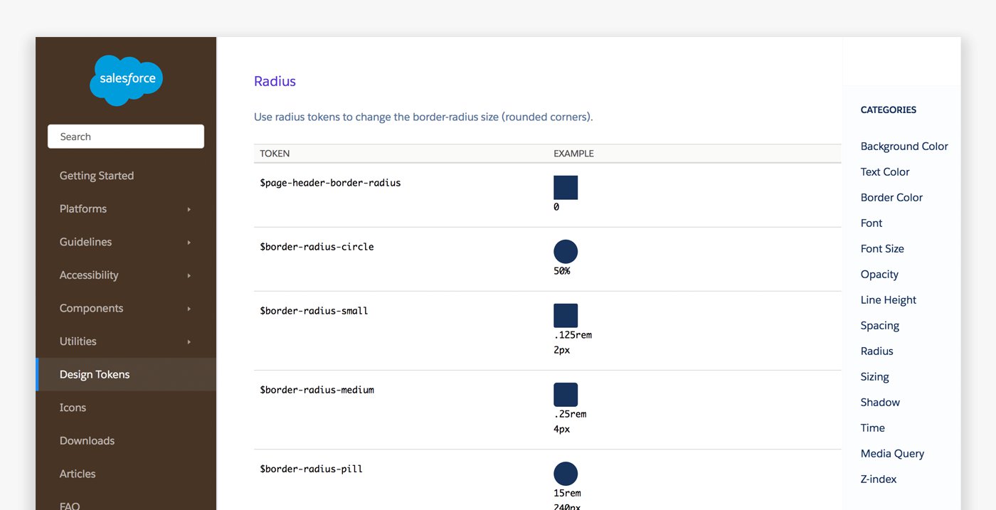
Design Tokens
Before we dive into visual design standards, I want to discuss design tokens. Design tokens are the “subatomic” foundation of a design system implementation. At its simplest, they’re name and value pairs stored as data to abstract the design properties you want to manage. With the values for all design tokens stored in a single place, it’s easier to achieve consistency while reducing the burden of managing your design system.
Example:
SPACING_MEDIUM: 1remIn design tokens you can store colors, spacing, sizing, animation durations, etc., and distribute them to various platforms.
Color
The colors you choose for your design system are more than just an extension of your brand. A UI uses color to convey:
- Feedback: Error and success states
- Information: Charts, graphs, and wayfinding elements
- Hierarchy: Showing structured order through color and typography
Common colors in a design system include 1–3 primaries that represent your brand. If none of these work well as a link and button color, then you may have an extra color for that as well. It’s a good idea to use the same color for links and button backgrounds as it makes it easier for users to recognize interactive elements.
You’ll likely have neutrals for general UI backgrounds and borders—usually grays. And finally, you’ll have colors for states such as error, warning, and success. Group these colors to see how well they work together and refine as needed.

The in-progress book, Programming Design Systems by Rune Madsen, has some great chapters on color available online to read, including “A short history of color theory.”
Larger design systems sometimes include colors for objects and products. For example, at Salesforce we had a color for contacts, for sales deals, or groups, and so on. We also had them for products: Sales Cloud, Marketing Cloud, Analytics Cloud, etc. Color can be a helpful wayfinding tool for your users.

Using color for wayfinding can be tricky to do while maintaining accessibility, as people who are color blind may not be able to discern some differences.
Depending on how strict you want to be with your palette, you may want to include a range of tints—a color mixed with white—and shades—a color mixed with black. Sometimes you may use other colors instead of white or black to avoid muddiness, such as an orange to darken a yellow so it doesn’t appear brown.
These color variations allow designers to have choices. But be warned, having too many choices can lead to major design inconsistencies. Keep your inclusion of tints, shades, and neutral palettes slim to prevent misuse of the system while still giving designers the flexibility they need. You can always add more colors as you find the need.

Figure 11. The Pivotal UI style guide chooses to give a wide range of color tints and shades with their design tokens. While I personally prefer to only give a leaner set of options (as seen in the Sass style guide), some design systems prefer to offer more choices. Consider which approach works for you as you balance concerns like creative freedom versus tighter consistency.
Typography
Fonts and weights
The fonts you choose have a high impact on both your brand and your user experience. Keep legibility in mind as you select the right fonts for your system. Keeping to common system fonts like Helvetica, Times New Roman, or Verdana can be a great shortcut, as they are familiar to the user’s eye. Some companies prefer custom web fonts to better reflect their brand, but pay special attention to how you use them as performance can be affected.
Most design systems I’ve worked on include just 2 typefaces: 1 font for both headings and body copy, and a monospace font for code. Sometimes there’s an additional font for headings that compliments the body font. Most design systems do not have a need for more, unless you have a system that supports multiple brands. It’s best to keep the number low as it’s not only a best practice of typographic design, it also prevents performance issues caused by excessive use of web fonts.

Figure 12. Google’s Roboto shown in varying weights.
These days it’s trendy to use a font at a very thin weight, but be aware that legibility can become an issue. If you want to use light or thin weights, only use them at larger text sizes.
Type scale
When selecting the size to set your type, consider the legibility of the font you’ve chosen. In most cases, a 16px font size works well. It’s the default font size in most browsers, and it’s quite easy to read for most people. I like using 16px as it works with the 4-based metrics used by Apple and Google (and is gaining traction as the standard approach). I recommend this as your baseline, though I would use it in a relative format like 1rem for CSS-based systems.
You can use a modular scale for larger or smaller font sizes for other elements such as headings. A modular scale is a set of numbers in which you have 1 base number, and a ratio to generate the next number. You keep applying the ratio to the new number to get yet another number.
Learn more about modular scales to create more meaningful typography.

Figure 13 The Modular Scale tool helps you find one that works for you. It even provides a Sass version of the tool, which you could add to your design token set.
As you design your type treatments, be sure to give thought to how it will respond to various screen sizes to maintain legibility. You won’t want your headings to be too large for mobile devices. And for much larger displays, you have the room to bump up sizes.
A common method is to enlarge headings on larger viewports. You can also use viewport units to scale your type based on a percentage of your screen size.

There are many methods people use to create responsive typography. A more recent one to check out is the Fluid method with CSS Poly Sizing. Zell Liew’s The Rules of Responsive Web Typographycover basic principles and systems to know.
Leading
Leading, or line-height in CSS, can improve readability and aesthetics of your typography. While the best line-height can vary depending on the font face and the line length, a general rule of thumb is to have leading at around 1.4–1.5x the font-size. 1.5 is recommended by the W3C Web Accessibility Initiative.
Line spacing (leading) is at least space-and-a-half within paragraphs, and paragraph spacing is at least 1.5 times larger than the line spacing.

WEB CONTENT ACCESSIBILITY GUIDELINES (WCAG) 2.0
W3C
It also makes your math more predictable, but you don’t have to calculate it. You can define your line-height without a unit of measurement and the browser will do all the hard math for you.
For headings, tighten it up depending on your typeface. In most cases, I find a 1.25 or 1.125 ratio works quite well.

Figure 15. Tachyons also use 1.5 for body and 1.25 for headings.
Spacing & Sizing
The system you use for spacing and sizing looks best when you have rhythm and balance. This means using numbers based on patterns and proportions. Using a consistent spacing scale also promotes maintainability through ratios by making layouts more predictable and more likely to “fit” and align well.
When I designed an Android app, I studied Google’s design guidelines. I noticed a pattern of using 8dp between elements and 16dp for outer gutters. It broke me out of using a 10-based scale I was accustomed to, as I found that 4-based worked so much better.
A 4-based scale is growing in popularity as the recommended scale for many reasons. Both iOS and Android use and recommend metrics that are divisible by or multiples of 4. Standard ICO size formats (which are used by most operating systems) for icons tended be 4-based (16, 24, 32, etc.) so that they scaled more easily. The browser’s default font size is usually 16. When everything is using this system, things are more likely to fit in place and line up. And finally, responsive math works out well.

Figure 16. The Google Android design guidelines (before this site was replaced by material design). Studying these guidelines made me a better mobile designer.
For horizontal spacing, an 8-based scale works quite well. You can make margins and padding equal or in proportion to the font size. But for vertical spacing, I tend to use a 12-based system. This is due to the line-height I get of 1.5 (with the default font size of 16px) getting us to 24.
Occasionally, you may have to break this rule. If you’ve added a 1px border to something, this border can throw off alignment by a hair. So you might find yourself using a padding or margin that subtracts that amount. This is something that you do on a case-by-case basis.
You probably want elements to grow and shrink with the content. For general sizing, avoid setting widths and heights unless totally necessary. You can achieve responsive design much easier if you let elements flow to fill the space they’re given in the layout.
Images
File formats
For icons and illustrations, I find using a vector format (SVG) works best for scalability and responsive design. However, if you find yourself needing to use photography, you may need to use a rasterized image format like JPG or PNG.
For most photos, illustrations, and diagrams, you can allow the image to go 100% to the container or viewport and let the height automatically set itself by not defining it. This works best for responsive layouts. You may also want to define some preset widths for images if you don’t want it to go full width (for example, half-width, a third, or a fourth). I recommend setting these as max-widths so that the image can rescale for smaller screens.
Iconography
Before drawing your icons, come up with your guidelines around them first. Will they be filled or outline? What is the line weight? Will they use more than 1 color? What sizes will they be? Is there an icon art boundary set inside an outer boundary?
Figure 17. Oracle Alta UI describes style guidelines such as perspective, strokes, and colors.
You may have different styles for different icon types. For example, utility and action icons (like a notifications bell or a settings cog icon) may be solid and 1 color, while navigation icons may be multicolored and more creative. Clear guidelines will keep your icons unified.
Figure 18. Apple shows the different icon types in their ecosystem: app icons, glyphs, and glyphs used on color.
Illustrations
Illustrations are a great way to add some character to your product. You can use these for empty states, loading screens, modals, and other components that invite visual interest. Shopify went to great lengths to produce unique illustrations for all of the empty states of their platform, which conveyed a strong sense of brand personality (figure 19).
Figure 19. Shopify’s illustration style for empty states.
Similar to icons, it’s helpful to have guidelines for the style of your illustrations (figure 20).

Figure 20. Illustration guidelines by Al Power.
Visual form
Visual form, or the material quality of your UI, is about the background images, gradients, and textures, shadows and elevation (z-indexes), rounded corners, and borders. These are visual qualities that help emphasize and decorate elements to add visual hierarchy and aesthetics. In any case, all are examples of ornamentation that need to be standardized.
Google does a great job indicating how depth and elevation work with layering of components (figure 21).

Figure 21. An example of depth through elevation in Google’s material design implemented through z-indexes and shadows.
Motion and Sound
When you define your visual language, motion and sound might not immediately come to mind. You experience these in a different way. But motion and sound can have a high impact on the experience of your app. You’ll want to have that systemized as well for consistency. I personally haven’t explored these areas as much as I’d like to admit, but there are some great examples in the wild.

Figure 22. IBM’s animation guidelines draw upon their rich history of products and technology.

Figure 23. While not very visually stunning, Microsoft offers guidelines into their sound API in their developer guidelines.
...
Before we conducted a visual inventory, which looked at the visual qualities of elements, such as color, spacing, and typography. Now, we will conduct a UI inventory, in which we look at the actual pieces of UI—like buttons, cards, lists, forms, and more. Where visual language is all about the visual approach and how things look on a global visual level, a user interface library (otherwise known as a pattern library) looks at actual components of a UI.
Let’s take a look at each of these design elements and the role they’ll play in your design system. Take stock of all interface elements in production to see just how much design debt you need to address and what elements are most commonly used. Warning! This can get a bit depressing, as most companies have an intense amount of inconsistency in their UIs.
To create an interface inventory simply open all products in production at your organization, screenshot all buttons, forms, various type styles, images, and collect them in a slide deck or on big posters where the whole team can see.
Visualizing design debt
If you have executives or engineers who are skeptical of the need for a design system, showing them your visual inventory can be a powerful way to communicate the design debt in your current products.
You can do this with cut out print-outs or through screenshots. Gather the folks you’re involving (as mentioned earlier in this chapter). Have them conduct this inventory with you, either through a shared presentation or via a hands-on activity. The idea is to gather the different components you’re using and categorize and merge them.
Some like dividing the pieces into elements, components, regions, utilities, and so on. Atomic Design is a great example of this line of thinking, which is a great conceptual model. But when it comes down to it, everything is pretty much a component, so at the end of the day, you could label all as such. But in general, what I see most design systems break things down into are:
- elements (or basics, or atoms)—these are small, stand-alone components like buttons and icons
- components (or molecules, or modules)—these are usually an assembly of small components into a larger component like a search form (which includes a form input, a button, and potentially even a search icon)
- regions (or zones, or organisms)—these are an area of the UI like a left-hand navigation
- layouts—how the pieces are laid out on the page (like a header region, followed by a sidebar and main content area, followed by a footer)

Figure 24. In From Pages to Patterns: An Exercise for Everyone, Charlotte Jackson goes over ways to conduct a UI inventory.
After you complete the inventory, you can merge and remove what you don’t need (either in a spreadsheet or even directly in a code refactor if you want more immediate change). Also, document what the component is and when to use it. This will become your UI library (or pattern library, or component library, depending on what your organization chooses to call it.).

Figure 25. The US Government agency 18F has one of my favorite UI libraries: the U.S. Web Design Standards.
Most design system documentation includes the component’s name, description, example, and code. Others may show meta data, release histories, examples, and more. What matters most is that you show what’s necessary for your team to get your work done.

Figure 26. The Rizzo component library by Lonely Planet.
...
Enterprise Design Thinking
...
Introduction
Start learning the theory, history, and language of Enterprise Design Thinking.
Design thinking is for everyone
Learn what design thinking is and why creating experiences matters.
“Everyone designs who devises courses of action aimed at changing existing situations into preferred ones.” - Herbert Simon

Design thinking is the mindset that aims to improve the situation of people through the experiences they have. If you’re interested in solving problems for people, then you can practice design thinking.
So, what is the experience?

It’s more than any product or service
Think of the last time you had tea, coffee, or hot cocoa. Maybe it was this morning. How did it make you feel? Why did you drink it? What else were you doing at the time?
Chances are your answers to those questions are different than anyone else who drank a hot beverage recently. Those answers represent your experience.

Design thinking requires you to consider a person’s experience in order to focus on their human needs. Your customers don’t inherently care about the inner workings of a coffee maker: they seek a quick pick-me-up, a comforting chat, or something warm on a cold day.
experience - "the way a person feels, and what they think while they’re doing something"
A vase is a vase is a vase
Were all those vases similar to yours? The prompt (design a vase) was too narrow for innovation and creativity to flourish...a common problem in the enterprise world.

Let’s take a step back, open the aperture a bit. Why would someone buy a vase? What purpose does it serve? A vase is only one way to enjoy flowers in your home. Try the activity again, but this time think of it as an experience.
https://www.ustream.tv/recorded/120268623
Design thinking isn’t just for designers
users - "the people who interact with the thing, service, offering, system, etc. that you make"
Design thinking isn’t just for designers
Even though it includes the word “design,” design thinking is a mindset that anyone can apply. It simply means that you’re starting to think like a designer—about how you can improve the current experience of the people you serve: your users.

Put the “enterprise” in Enterprise Design Thinking
Learn the framework of Enterprise Design Thinking and why it’s necessary for modern enterprise work.
You aren’t in the flower business
Think back to the vase experiment in the last lesson. Enterprise businesses don’t often face vase-sized problems. We work with problems that shape industries and governments. The nature of these problems requires a special flavor of design thinking that can cover the scale and complexity we face in our daily work.
An Overview of Enterprise Design Thinking
https://www.ustream.tv/recorded/119982334
Watch this video to see what Enterprise Design Thinking is about and why it was created.
Enterprise Design Thinking
a tailor-made approach for large, distributed teams to help them quickly deliver human-centered outcomes to the mark
Our shared language
We all communicate through language. But, communication easily breaks down when we aren’t speaking the same language. Throughout this course, you’ll explore the vocabulary of Enterprise Design Thinking and start to put the words to work. The Framework allows you to speak about design thinking across large teams and companies and stay on the same page.
The Enterprise Design Thinking Framework
Take a minute to explore the vocabulary of Enterprise Design Thinking.
The Principles
The Principles guide your day-to-day work. They ensure you’re keeping your user in mind, collaborating with a diverse team, and continuously trying to improve your solutions.

The Loop
Understand the present and envision the future in a continuous cycle of observing, reflecting, and making.

The Keys
Scalable practices for enterprise team alignment

The Principles guide your day-to-day work.
They ensure you’re keeping your user in mind, collaborating with a diverse team, and continuously trying to improve your solutions.
A focus on user outcomes
Drive business by helping users achieve their goals.
Restless reinvention
Stay essential by treating everything as a prototype.
Diverse Empowered Teams
Move faster by working together and embracing diversity.
The Loop
Understand the present and envision the future in a continuous cycle of observing, reflecting, and making.
Observe
Immerse yourself in the real world with design research. Interview users, watch them work, and test your ideas with the people who matter most to inform your decision-making and understanding.
Reflect
Come together and look within to synchronize your movements, synthesize what you’ve learned, and share your “aha” moments with each other. Decide together and move forward with confidence.
Make
Give concrete form to abstract ideas. The earlier you make the faster you learn. Put your ideas out there before they’re complete and improve them as you go.
The Keys
Scalable practices for enterprise team alignment.
Hills
Align your team around the meaningful user outcomes you want to achieve. Hills are statements of intent written as user enablements. They follow a format of Who, What, and Wow.
Who: Who is your user? Refer to them by name.
What: What will your user be able to do that they couldn’t before? Start with a verb and avoid solutions.
Wow: What differentiates you from the competition? This is measurable.
Playbacks
Stay aligned by regularly exchanging feedback. Playbacks are story-based presentations that share insights, ideas, and updates to a user experience.
Sponsor Users
Invite users into the work and stay true to real-world needs. Sponsor Users are external clients, future clients, or end users that represent your target user, who regularly contribute domain expertise to your team. Relationships with Sponsor Users are typically formalized with an agreement that covers confidentiality and our right to use their feedback.
The Enterprise Design Thinking Framework
Keep these terms top of mind.

Prepare yourself
See examples of teams successfully using Enterprise Design Thinking to solve complex problems and gear up for the rest of the course.
https://www.ustream.tv/recorded/119982034
Watch this team use Enterprise Design Thinking to improve their users’ experiences.
Change is hard
tools - "activities and resources that help your team work collaboratively to yield specific artifacts. Explore them in the Toolkit."
https://www.ibm.com/design/thinking/page/toolkit

Business as usual: a team sitting and listening in a meeting.

Enterprise Design Thinking: a team collaborating around a board.
The team you just saw is doing great things with Enterprise Design Thinking. But this definitely isn’t their first time practicing it. Adopting Enterprise Design Thinking and experiencing the great outcomes that you just heard about doesn’t happen overnight.
Like all of the best things in life, Enterprise Design Thinking is an ongoing journey filled with highs and lows. It takes some effort and commitment, but the results are worth it. This platform is designed to give you the tools and knowledge you need to address the challenges and harness the opportunities you will face as you begin your practice.
Are you ready to dive in?
Your challenge
All Enterprise Design Thinking initiatives start with a business problem, like low employee retention or uncovering a new market segment. In the next few lessons, you’ll work through a business problem by framing it around human experiences and learn the Principles of Enterprise Design Thinking along the way.
...
A focus on user outcomes
Drive business results by focusing on your users’ needs.
Identify your users and their problems
See how working with users can help your team address complexity and ambiguity.
a focus on user outcomes - an Enterprise Design Thinking Principle that represents putting your users at the center of your work and solving for their needs
Complexity and ambiguity
Enterprise teams, like yours, deal with complex ecosystems that take years to learn and master. They offer countless rabbit holes, worm holes, plot holes, pot holes, and any other kind of ambiguous situations you can think of. Finding enough clarity to decide on the best thing to do within this intricate web can sometimes seem impossible.

But, it doesn’t have to be so hard. Finding clarity can be as simple as focusing on the most important thing. In design thinking, the most important thing is people. In Enterprise Design Thinking, we call this a focus on user outcomes.
A focus on user outcomes
When you focus your team and your work around your users and their needs, you’re able to more easily decide what’s important. This makes your offerings more essential to the people who use them. If all you did was ask:
Who are our users?
What is their current experience?
How could it be improved?
over and over again, you would get closer and closer to understanding your users and creating an ideal future for them. This allows you to put a more valuable offering into your client’s hands and into the market.
Business problems to human-centered problems
Business problems, like those you are asked to solve day to day, are often focused on something nonhuman, like the bottom line or brand recognition. In order to start focusing on your users, you have to identify the user problems that underlie the business problem.

Uncover the Problem
Adam Cutler, Enterprise Design Thinking Leader, explains the value of knowing what problem you’re solving, for whom, and why.
https://www.ustream.tv/recorded/120135766
Case Studies
The airline problem: Think back to the business problem we gave you in the last lesson. The original problem was: Windsor Airline’s consistent flight delays are hurting the company’s bottom line. This complex problem could quickly overwhelm anyone, but focusing on users and their problems can help make it more straightforward.
Ask why?
The 5 Whys activity digs deeper into a problem or uncovers the intent behind an idea. Let’s find the root cause of the original problem facing Windsor Airlines.
What is the business problem?
Windsor Airline’s consistent flight delays are hurting the company’s bottom line.
Why might that be?
Because the majority of their flights don’t depart on time.
Why?
Because on average the gate isn’t locked 10 minutes before a flight’s scheduled takeoff.
Why?
Because the dispatchers don’t have the passenger data, which is legally required for the gate to close.
Why?
Because it’s not clear who’s on the final passenger list.
Why?
Because gate agents struggle to negotiate last-minute passenger changes.
Compare the original problem statement to the statement after the 5 Whys activity. Now we’re closer to the root cause of Windsor Airline’s problem and have a specific user to focus on—gate agents.
The original business problem
Windsor Airline’s consistent flight delays are hurting the company’s bottom line.
The user-centered problem after 5 Whys
Because gate agents struggle to negotiate last-minute passenger changes.
The current situation to improved future

Complex systems, like the efficiency of the airline’s boarding process, impact a lot of different types of people. That’s okay. We expect that from enterprise problems. The key is to identify the users who are impacted the most.
Next, you need to work to understand these users’ current experience. Design thinking at its core is the process of understanding the situation, recognizing where it can be improved, and then creating a better future for the people involved. This is the concept of moving from as-is to to-be.
Working With Sponsor Users
https://www.ustream.tv/recorded/120289996
Sponsor Users are more than just focus groups. See how a team built a relationship with its users and truly co-created for meaningful results.
Recognize your assumptions
Identify how biases affect your work and bring attention to your assumptions.
The airline problem
In the last lesson, you answered some questions about Windsor Airlines gate agents’ current experience. Those answers were assumptions you made based on your own viewpoints. It’s okay to make assumptions, but on their own, they’re a flimsy foundation.

Make assumptions
You are not your users
Constant refinement and validation of assumptions as you learn allow you to paint a clear picture of your users’ true experiences. We’re not Simon, the gate agent. While we may have some similar experiences, we can never fully know firsthand what his life is like. In order to get as close as possible, we have to address our assumptions by learning, observing, and practicing design research.
design research - "the practice of inquiry and discovery that builds knowledge, insight, and empathy for your users"
Getting to Know Your Users
Check out this story about a team that uncovered something new about their users, and how those new insights ultimately changed their solution.
https://www.ustream.tv/recorded/119982419
Observe to learn more
See how design research can help you discover the truth.
At its core, design research is very simple. All you have to do is watch and listen.
Observation builds empathy
Dig deeper than a requirement list. Remember: We’re not here to design a “vase.” We’re here to understand someone’s wants and needs, worries and goals, contexts and constraints. Building empathy for users and uncovering their needs will always get you much closer to solving business problems than blindly improving your product or service.
empathy - the action of understanding, being aware of, being sensitive to, and vicariously experiencing the feelings, thoughts, and experience of another
Stay curious
As you build your design research skills, it’s important to harness your natural curiosity. Think back to when you were a kid. How often did you ask questions about the world just because you were curious? As children we ask why regularly, and often don’t settle for the first answer. Reignite that unrelenting curiosity as you conduct design research.

As you saw in the previous lessons, asking why helps you understand your users’ real problems, so that you can solve those problems in a meaningful way. Make why your favorite word when you try to learn more.
Try it today
Design research is an advanced skill. When you feel overwhelmed by a complex domain, try some of these methods to learn more:
- Next time you review an idea, design, deliverable, etc. ask yourself what the user would think of it. Then go through the 5 Whys activity to dig deeper.
- Have questions? Do some desk research (you can learn a lot about a person’s experience on the internet), or interview a stakeholder or subject matter expert to start to get a handle on things before talking to users.
- A lot of users will document their experiences and share them online, which can be a great way to observe remotely. Think user-generated videos, review sites, and social media.
A focus on user outcomes summary
Great job! You’ve already started to focus more on your users. Download this handy summary of everything you learned this lesson to refer back to as you work.
Want to read more about focusing on user outcomes? Check out the Framework.
...
Restless reinvention
Treat everything like a prototype so you can quickly improve solutions
Bias toward action
Learn how viewing everything as a prototype is key to breaking out of the status quo.
The slow and timid enterprise
Your smartphone updates its operating system seamlessly in the background. Your neighborhood café changes its menu seasonally. So why does it take two years for your team to update your users’ experience? Even when you do get to make changes, they’re small and feel like they might be irrelevant.

Modern expectations
“The last best experience that anyone has anywhere, becomes the minimum expectation for the experience they want everywhere.” - Bridget Van Kralingen

Quick and continuous improvement used to be a luxury, a way for companies to differentiate themselves. Today, people expect to see constant updates. You can inform those updates with easily gained knowledge about the people you serve.
"restless reinvention" - a principle of Enterprise Design Thinking that represents active continuous testing and learning in order to improve the solution to a problem
https://www.ustream.tv/recorded/119982516
Restless Reinvention: Our Work is Never Done
See how the Principle of restless reinvention encourages you to harness the knowledge you have to continuously improve.
prototype - "a first or early example that is used as a model for what comes later"

Horse-drawn carriage

Self-driving car
If you start looking at everything you make as a work in progress, you can begin to shift your mindset from waiting until something is perfect to waiting until it’s ready. This mode of working enables more regular delivery of value to users.
Consider this: We’re still improving the way we get from Point A to Point B. Yesterday’s horse-drawn carriage was a prototype for today’s automobile. Today’s automobile is just another prototype for tomorrow’s transportation breakthrough. We’re really never done and no solution is ever perfect, but people experiment with how to improve this experience daily all over the world.
Give form to ideas
Everything starts as an idea, but you can’t learn much about an idea without giving it some form.

Visualize your ideas, so that your team and users can understand them clearly. Making doesn’t have to be intricate. It can be as simple as a sketch on a napkin—but it does need to communicate the idea enough for someone else to understand it and give you feedback.
Low stakes, big reward
Take the pressure off yourself. Acknowledge that making something quickly and putting it in front of people is the best way to learn if your ideas suit their needs. You can always toss the piece of paper in a recycling bin. This makes it easier, cheaper, and faster to challenge the status quo with new ideas, and iterate on them until they’re ready for the real world. This way, you can meet your users’ expectations and your market deadlines.

iterate - "to change something existing (an idea, a product, a service, etc.) in small or big ways, gradually, as to improve it"
Try it today
The next time you have a new idea to share with your team, before you tell them about it, draw it on paper. Think about how a diagram or visual representation might convey something that words couldn’t. After all, a picture’s worth 1,000 words.
Actively seek great ideas
Practice coming up with creative ideas and learn how absurdity can accelerate team brainstorming.
Quantity over quality
The most brilliant ideas are found among a multitude of ideas. Don’t limit your brainstorming. Your first few ideas are going to be really obvious, so get them out onto paper first to make room for your more interesting ideas to flow. Don’t stop until you’ve come up with as many as possible, even if you think you have “the answer.”

Stretch your thinking
Ideas are everywhere. You have them everyday. And while there are no bad ideas, some ideas are better than others. Ideating takes practice. Your brain is a muscle (not really, but let’s pretend) that is really good at doing the things it’s done over and over again, but it needs to stretch and strengthen in new ways in order to do new things.
ideating - the practice of coming up with new ideas
Warm up for brainstorming
Before we start coming up with ideas to help the gate agents, let’s do a quick mental warm-up to flex the visual-thinking side of your brain.
https://www.ustream.tv/recorded/120558328
Think about Elizabeth
An easy way to help stretch your thinking is to change the context or constraints of your situation or problem.
For example, think of the Windsor Airlines problem you’ve worked with throughout this course. Let’s zoom in on Elizabeth, one of the Windsor Airlines gate agents. You’ve already uncovered a little bit about her: she deals with requests from angry customers, in a loud and busy environment, all while trying to determine who will be added to a given flight itinerary in a matter of minutes.

Let’s talk absurdity
Obviously there aren’t any airports on the moon (yet), so the last idea you came up with isn’t directly useful to Elizabeth, the gate agent. However, just creating that idea or sharing it with others will likely spark new thinking. Prompts like “...on the moon” automatically trigger non-obvious ideas. And that’s how you get to something no one else does yet.
In order to solve problems in new and competitive ways, we need some brilliant ideas. How do we have brilliant ideas? By leaning into the absurd.
“If at first, the idea is not absurd, then there is no hope for it.” - Albert Einstein

The Idea Curve

Dev Patnaik: From The Ebb and Flow of Ideas, a Product Development - Best Practices Report
Over the course of time, ideas ebb and flow. They’ll start as boring and move between absurd and brilliant. The more absurd the idea, the more likely it will spawn a brilliant one. So when ideating gets stale or hard, try a strange or silly prompt.
Try it today
Next time you’re stuck in a rut of stale ideas, come up with a silly prompt to kick-start your brainstorming. Try thinking of your users’ problem in a different context, like “without modern technology,” or “in the year 3019.”
Take risks
See how incremental changes mitigate risk.
Let’s talk about failure
Failure gets a bad rap. It’s something many people fight to avoid at all costs. In fact, some people are so afraid of failure that they never take any risks at all. But in order to make great things and find answers to the most complex problems, we have to take small, more manageable risks (which sometimes result in failure).
Think about scientists. They constantly rely on failure to disprove hypotheses and come up with their next theory. They test and disprove, then test again and disprove. It’s a series of small failures that lead them closer and closer to the truth.

Failing as opportunity
Design thinking works in the same way. As you fail quickly and cheaply, you get closer and closer to the best solutions. In fact, if you’re not failing, you’re probably not doing anything interesting. When you recognize that it’s okay to be wrong, you open yourself up to new possibilities and better ideas.

Reflect
How did that failure affect you?
What did you learn from it?
What did you do to avoid that same failure in the future?
How To Fail Fast And Cheap
https://www.ustream.tv/recorded/120558331
See how a team used failure to their advantage.
Reflect on your own work
What could you make and test quickly and cheaply?
How would you make it?
How would you measure its success or failure?
Restless reinvention summary
Great job! You’ve already started to restlessly reinvent. Download this handy summary of everything you learned this lesson to refer back to as you work.
...
Diverse Empowered Teams
Collaborate better across perspectives and expertise to act on breakthrough ideas.
Include a variety of voices
See how diverse perspectives can elevate the quality of your work.
Break the silos
Enterprise companies work in complex domains with wide networks of users, stakeholders, technologies, and contexts. The value of diverse perspectives becomes even greater as your problem space gets more complex. If you work in silos—entirely separate from other roles—a single viewpoint will limit the output of your work.

Solving problems is a team sport. Enterprise Design Thinking asks that you collaborate as a whole team to get the job done.
The multiplied effect of teams
All the practices we’ve explored so far—design research, observing users, brainstorming, and ideating—are amplified when you do them as a Diverse Empowered Team.
Diverse teams have varied perspectives, skills, and backgrounds. They build upon each other’s ideas, enrich each other’s knowledge, and challenge each other’s assumptions in ways that accelerate the work.
Empowered teams have the agency to make everyday operational decisions on their own. They’re equipped with the expertise and authority to deliver outcomes.

Diverse Empowered Teams - "an Enterprise Design Thinking Principle that represents that a group of people with varied perspectives more successfully make decisions together and work toward shared goals"
Ideas amplified
Think back to your ideas to improve Elizabeth’s experience as a gate agent. On your own, you came up with some interesting thoughts, but let’s take a look at other ideas from people taking this course.

You might see some ideas similar to yours, and others that didn’t cross your mind. Are you inspired to update your own ideas based on what you see now? This is the value of Diverse Empowered Teams: coming to meaningful breakthroughs by seeing a problem from a different point of view.
Collaboration in Action
Watch a Diverse Empowered Team work together to take on everyday challenges.
https://www.ustream.tv/recorded/119982524
Evaluate your team
Pause and reflect on your own team’s diversity. Remember to consider different types of diversity, such as skill sets, backgrounds, cultures, genders, and more.
What diverse points of view do you have on your team?
What perspectives are missing from your team that could improve your process and outcomes?
Build alignment across your team
See the value of alignment and get some tips to try in your next meeting.
Overcome diversity pitfalls
While inclusion of many voices builds strong ideas, it also increases chances of misunderstanding and conflict. These pitfalls can be detrimental if they aren’t addressed properly. Diverse teams are most successful when they can bring their different viewpoints together and find alignment.
alignment - "a state of agreement and understanding on a group decision that includes follow-through on that decision"
Identify if you’re aligned

Sometimes you assume you’re aligned when you’re not. Teams break out into solo work and end up duplicating efforts, or delivering things that aren’t useful.
Alternatively, teams might belabor a conversation when an agreement has already been reached, and get stuck spinning in circles. In order to break free from these business-as-usual problems, you first must recognize them.
Reflect on your own work
What is one thing you’re working on that your team might not know about?
Is there something your team has reached agreement on, but the work hasn’t progressed?
Try it today
How’s your work calendar looking? Full of meetings? Many meetings lack productive outcomes. Maybe you’ve been there: an hour of talking ends in the same place it started or a contentious 30 minutes leaves everyone feeling frustrated. Instead, take these as opportunities to start aligning your team.
- Next time you’re in a meeting where the conversation spins in circles, ask everyone to grab something to write with, visualize their thoughts, and then take turns sharing.
- Next time you’re in a meeting where only one or two people share their opinion, hold a silent and anonymous voting session to expose everyone’s viewpoints.
Start sharing stories
Learn how to share your work in progress.
How things stick

One way to drive healthy collaboration and alignment amongst your diverse team is through storytelling. Good storytelling is the reason kids remember Luke Skywalker and Elsa, but forget what they did after school yesterday. The same rules apply to your work. Playbacks are opportunities to tell memorable, human-centered stories that share ideas, prototypes, strategies, and more.
Playbacks - "an Enterprise Design Thinking Key, story-based presentations that bring stakeholders and whole teams together in a safe space to exchange feedback"
Build Playbacks into your workflow
There are a few specific moments where everyone on the team needs to be aligned:
- Starting a new project or initiative. Answer questions like: Who will be the users and stakeholders? What experience are we trying to improve and why?
- Deciding as a team on a future experience for your users. Answer questions like: What do we think our users need to be successful? How are we going to serve those needs?
- Reviewing progress as you deliver. Answer questions like: Do we successfully deliver value to our users? Are we still aligned as a team?
Teams who share their goals by talking about a user and their needs, and invite feedback along the way, are more likely to understand and deliver on those goals together over time.
Different Types of Playbacks
https://www.ustream.tv/recorded/119983695
See how different Playbacks look and feel depending on your desired outcome—from quick and casual to formal and prepared.
Let’s try it out
Think about our Windsor Airlines problem. You’ve worked on it throughout this course, so let’s put those pieces together into a story you could share with your team—or in theory, Windsor Airlines stakeholders.
Start with why you’ve been working on this, in other words: the business problem.
Windsor Airline’s consistent flight delays are hurting the company’s bottom line.
Now, build out the story.
- Who is the hero of your story? Hint: This is the user.
- What is their current struggle today? What problems do they face?
- What’s one idea you have to solve their problem?
- How would that idea improve the user’s experience?
Diverse Empowered Teams summary
Great job! You’ve already started to consider the makeup of your team and how you can all stay aligned. Download this handy summary of everything you learned in this lesson to refer back to as you work.
...
Make a plan
Set yourself up for continued success with Enterprise Design Thinking.
What about tomorrow?
Learn more about problem statements and craft one to frame your own work in terms of user outcomes.
So, what’s next?
You’ve learned about the core concepts and practices of Enterprise Design Thinking throughout this course, but tomorrow you’ll be confronted with “business as usual.” Your daily habits are really hard to break—like checking your email and going to meetings without sharing your great ideas. You might even revert back to a focus on your own problems instead of your users’.
But, that’s not the plan for you.
You’ll stop designing “vases.”
You’re going to start applying Enterprise Design Thinking to your everyday work.

Define your problem
Your first step to practicing Enterprise Design Thinking is to refocus your work as a user-centered problem.
“A problem well-stated is a problem half-solved.” - Charles F. Kettering

Put another way, the first step to answering the question is knowing what questions to ask. In design thinking, to solve for an actual need that exists in the world, you must take the time to write clear problem statements around your intent: What problem are you solving, for whom, and why?
Business problems to human problems
Remember the 5 Whys activity that took us from a business problem to a human problem? Of course, you do! Try it now with your own work to redefine your problem space through the eyes of the people you serve.
What business problem are you trying to solve?
Why might that be?
Why? Why? Why? Why? Why? (5 Why?)
Problem statements
Problem statements help us answer the question: “Where do we start?”
They put the user front and center, and align everyone around a clear issue to solve. However, they don’t dictate implementation or a specific solution. Problem statements are often the seeds of Hills.
Here’s one formula for problem statements:
Hills - a Key of Enterprise Design Thinking, a human-focused mission statement that describes a future enablement for a specific user

How To Write A Great Problem Statement
https://www.ustream.tv/recorded/119982553
Learn how to craft a sentence that frames your users’ current pain points.
Use the Principles
- A focus on user outcomes: Problem statements should always include a user and their current problem—not yours.
- Restless reinvention: Problem statements should be flexible and iterative as you learn more about your users and their current state.
- Diverse Empowered Teams: Problem statements should be written with all members of your team who bring relevant expertise.
Try writing your own
Take the problem you came up with after the 5 Whys exercise and reword it as a problem statement.
- What problem do your users have today?
Is this problem statement written about your users (aka: the people who use your product or service)?
- Update your statement as needed.
Does this problem include a solution or pre-determined implementation?
- Update your statement as needed.
That’s one fine looking problem statement!
Notice how your problem statement has evolved to focus on a particular user and their pain point.
Now, do something with it
You can go many places from here.
Use your problem statement:
- as a source of research questions you want to answer
- as a prompt for brainstorming ideas for solutions
- as a discussion point for your whole team to align around a shared goal
Make a plan
Make it official.
How will you use your problem statement after this course?
Reach out to people on your team who are interested in design thinking, or have some experience with it already. Schedule time this week to work with them on your plan.
Put it all together
Wrap up the whole package of Enterprise Design Thinking and test your understanding.
Kiến thức về UX Design
...
...
...
- AARRR: https://medium.com/@ms.mbalke/aarrr-framework-metrics-that-let-your-startup-sound-like-a-pirate-ship-e91d4082994b
- Google HEART: https://www.interaction-design.org/literature/article/google-s-heart-framework-for-measuring-ux
- http://www.uxforthemasses.com/ux-metrics/
...
- https://uxplanet.org/design-checklist-for-the-perfect-charts-189fa35032df?fbclid=IwAR2B5Ia-ATaMM2u2g7Y1kDfcbYWjs1wM-9ghi2uCySF42APPteCX33rGQ3k
- https://www.facebook.com/groups/eggpresso/permalink/441236809948182/
- https://medium.com/google-design/motion-design-doesnt-have-to-be-hard-33089196e6c2
- https://medium.com/swlh/leveraging-mental-models-in-ux-design-21ba8fbce22d?fbclid=IwAR1SrrD5nFfBTBPdc-aqhhQisdAac2YA9LfIexJ4Z8HXTW03bkToBjMDyCc
- https://www.researchgate.net/publication/225367546_Touch_Screen_User_Interfaces_for_Older_Adults_Button_Size_and_Spacing?fbclid=IwAR2W6GfFjgDLj_ByLh5MUwAsrcxVcF4g28_K-xV6X_pVlr_nj5VGnR-2lJ0
- https://uxmovement.com/buttons/add-to-cart-vs-add-to-bag-which-button-label-to-use/?fbclid=IwAR161VV-QhA0ZRpa4nwsKjsiIEvgds6Rh_s1HjyT2KbcEeWvx0vdFFRd4WI
...
- https://www.smashingmagazine.com/2018/03/building-a-ux-team/
- https://uxdesign.cc/3-design-team-structures-centralized-embedded-and-the-elevator-team-f2970008ed41
- https://uxlagi.com/?fbclid=IwAR3THkVCE6dHjGjt7iqOFLTF4Cyp9pj0R5CMNwB6AoenvXr80R0fUmMNqvM#!#17
...
SaaS Metrics:
...
- https://blog.recurly.com/better-way-to-calculate-your-churn-rate?fbclid=IwAR3ysyfw5EfTdLX_yzjjgFAUihSq_F4O8DwC9t-TJreFRelxfN4zwOr1cJM
- https://blog.hubspot.com/service/saas-metrics?fbclid=IwAR1cApQgN2LK0O0zpanqsoO8g0xwT6Z7vkWcsjriCtej_DiJx5_VRT-3AZs
- https://www.slideshare.net/DavidSkok/the-saas-business-model-and-metrics?fbclid=IwAR2LbkFh_oiSwiU7fs84lIpbv5KITThSbYbfRtR5N07Baht-lviYpgWLypU
- https://medium.com/growth-tribe/if-you-are-going-to-read-one-intro-guide-to-saas-metrics-this-is-it-b0f480716a4e?fbclid=IwAR2tJjJ5kI6ElAes9Iz0ZOnFFfVdiIRwb7br8y7–fdZcNdLDrUso8GvftA
...