Design System
- Hieu Dao
Các kiến thức cần ghi nhớ trong việc thiết kế Design System
| Nội dung | URL |
|---|---|
Lý thuyết: A design system is a series of components that can be reused in different combinations. Design systems allow you to manage design at scale. Example:
Another name: Design System = Atomic Design = Design Language = Modular Design = Component Design Why should you use a Design System?
Style Guides, Pattern Libraries, Design Systems
Atomic Design Process:
Atomic design: how to design systems of components Nowadays, digital products must be able to exist across any and all devices, screen sizes, and mediums at the same time:
So why the hell are we still designing our products by “page” or by screen?! → Instead, we should be creating beautiful and easy access to content, regardless of device, screen size or context. How is this different than before?
Everything starts with the brand identity
Enrich the system - Think generic
The part and the whole - Mutualize the work
Share the system
Three golden rules for great architecture:
Design principles:
Shopify’s Polaris Design System is one of the best examples. On the homepage, they’ve already broken down all the core sections:
Atomic Design & creativity: When you really find your own interpretation on how to use Atomic Design, you can decide precisely where and when you want to give room to creativity. Examples:
|
|
| Một số ví dụ: |
|
| Tiêu chuẩn thiết kế: | |
| Plugins: |
|
| Enterprise Design: |
|
| Toolkits |


.jpeg?version=1&modificationDate=1553625195717&cacheVersion=1&api=v2&width=411&height=250)


.jpeg?version=1&modificationDate=1553625197105&cacheVersion=1&api=v2&width=362&height=250)


Designing your design system - Step by Step
| Step | Content: https://www.designbetter.co/design-systems-handbook/designing-design-system |
|---|---|
| Step 1 - Who should be involved | Before beginning work on your design system, take a moment to think about the team you’ll need to bring it to life. Who needs to be involved? Spoiler alert! You’re going to need more than just designers. Here’s a quick list of the disciplines that can be represented in your team to create an effective design system:
Once you’ve got the right skillsets represented in the design systems team, identify leaders to represent each area. These people should be able to drive decisions forward. Know who on the team can advocate for each of the areas of the design system. With a team of experts guided by strong leadership, your next task is to establish the right team model to help you achieve your goals. |
| Step 2 - Choosing the right team model | https://medium.com/eightshapes-llc/team-models-for-scaling-a-design-system-2cf9d03be6a0 The solitary model: an “overlord” rules the design system.
The centralized team model: a single team maintains the design system as a full-time job.
The federated model: team members from across the company come together to work on the system.
There are strengths and weaknesses in each of the above models. A solitary model is fast and scrappy, but with 1 person in charge of so much, the “overlord” can become a bottleneck to the completion of many tasks. A centralized team, on the other hand, keeps the system well maintained, but the group may not be as connected to the customers’ needs as they may be less involved in user research. Finally, a federated team has great insight into what’s needed for all the product features and user needs, but this group can be quite busy working on those areas outside of building the system. Many teams are moving away from the solitary model to the centralized or federated model. As Curtis mentions in his article, overlords don’t scale. The centralized or federated models are usually much better for scaling a design system. I wrote about the Salesforce team model in response to Curtis’s piece. When I was at Salesforce on the Lightning Design System team, we used a combination of the centralized and federated models. In an enterprise organization as big as Salesforce, a centralized design systems team was not enough on its own. With so many key players involved and the amount of ground we had to cover across products and platforms, we needed a more sustainable approach.
|
| Step 3 - Interviewing customers | As with any product design process, it’s important to do your research. Who will be using your design system and how will they use it? Your design system will get used much more often if you create it to fit into the workflow of other teams. By interviewing users, you can pinpoint problems ahead of time, define principles that will help others use the system properly, and focus your energies on the most important things. A less common group of people to interview are members of your open source community. This exists more likely in organizations that provide developer tools for customer and partner communities. If you plan to open source your design system—a potentially bigger project—then you’ll need to speak with potential contributors and consumers to discover what use cases your design system will need to satisfy. And then there are the executives, leaders, and management. It is important to get their thoughts as well. You will need their buy-in to support and fund the system. Listen to their concerns and use them as actionable goals and metrics to achieve. Examples of requests might be shipping features faster, better performance, and improved UI quality. With insights in hand from customer interviews, it’s time to take an inventory. There are 2 types of interface inventories to be created:
Let’s first focus on a global visual inventory. |
| Step 4 - Creating a visual inventory | Of course, if you’re starting a design system for a product that doesn’t yet exist, you can skip this step and jump straight to creating a visual language for your new product. Lucky you! Conducting a visual audit As we start to take inventory, it’s good practice to take a look at the CSS used to create all of those elements you just captured in your visual inventory. Use a tool like CSS Stats to see how many rules, selectors, declarations, and properties you have in your style sheets. More relevant, it will show you how many unique colors, font sizes, and font families you have. It also shows a bar chart for the number of spacing and sizing values. This is a great way to see where you can merge or remove values.
If you’re creating an inventory in Sketch, use the Sketch-Style-Inventory plugin to aggregate all colors, text styles, and symbols. It also gives you the ability to merge similar styles. |
| Step 5 - Creating a Visual Design Language | I must admit, as an art school graduate the visual design language in a design system is my favorite part to work on. I love thinking about color theory, typography, and layout, which are at the core of any design system. If we break apart each component of a design system we find that these fundamental elements make up its visual design language:
Depending on your needs, you may also include the following to further standardize the user experience:
Consider the role each of these design elements plays in a simple component like a button. A button typically has a background color, typography for the label, and spacing inside it. There may be an icon next to the label to create a visual cue. A border on the edge serves as simple ornamentation and may even round the corners. Finally, hovering over or clicking the button could trigger animation or sound as feedback to the user. Though a button may seem simple, there are many design decisions required to bring it to life.
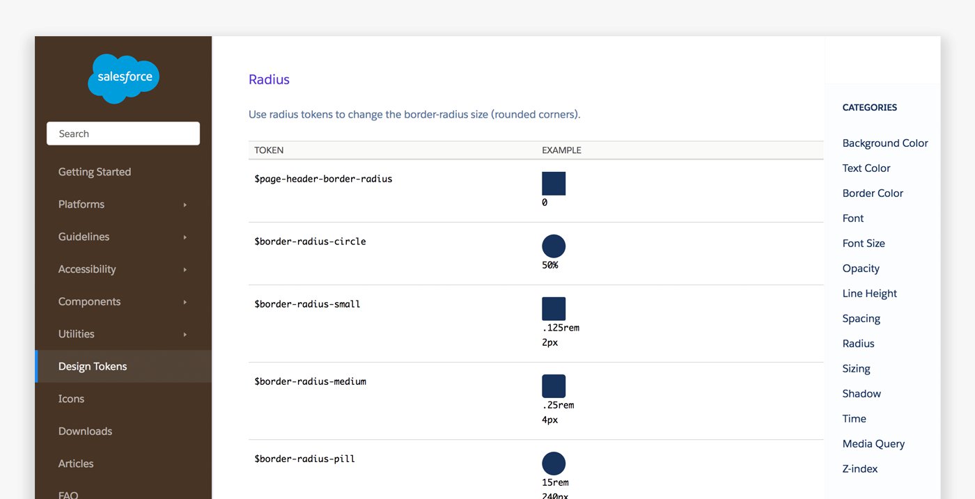
Design TokensBefore we dive into visual design standards, I want to discuss design tokens. Design tokens are the “subatomic” foundation of a design system implementation. At its simplest, they’re name and value pairs stored as data to abstract the design properties you want to manage. With the values for all design tokens stored in a single place, it’s easier to achieve consistency while reducing the burden of managing your design system. Example: SPACING_MEDIUM: 1rem In design tokens you can store colors, spacing, sizing, animation durations, etc., and distribute them to various platforms.
ColorThe colors you choose for your design system are more than just an extension of your brand. A UI uses color to convey:
Common colors in a design system include 1–3 primaries that represent your brand. If none of these work well as a link and button color, then you may have an extra color for that as well. It’s a good idea to use the same color for links and button backgrounds as it makes it easier for users to recognize interactive elements. You’ll likely have neutrals for general UI backgrounds and borders—usually grays. And finally, you’ll have colors for states such as error, warning, and success. Group these colors to see how well they work together and refine as needed.
The in-progress book, Programming Design Systems by Rune Madsen, has some great chapters on color available online to read, including “A short history of color theory.” Larger design systems sometimes include colors for objects and products. For example, at Salesforce we had a color for contacts, for sales deals, or groups, and so on. We also had them for products: Sales Cloud, Marketing Cloud, Analytics Cloud, etc. Color can be a helpful wayfinding tool for your users.
Using color for wayfinding can be tricky to do while maintaining accessibility, as people who are color blind may not be able to discern some differences. Depending on how strict you want to be with your palette, you may want to include a range of tints—a color mixed with white—and shades—a color mixed with black. Sometimes you may use other colors instead of white or black to avoid muddiness, such as an orange to darken a yellow so it doesn’t appear brown. These color variations allow designers to have choices. But be warned, having too many choices can lead to major design inconsistencies. Keep your inclusion of tints, shades, and neutral palettes slim to prevent misuse of the system while still giving designers the flexibility they need. You can always add more colors as you find the need.
Figure 11. The Pivotal UI style guide chooses to give a wide range of color tints and shades with their design tokens. While I personally prefer to only give a leaner set of options (as seen in the Sass style guide), some design systems prefer to offer more choices. Consider which approach works for you as you balance concerns like creative freedom versus tighter consistency. TypographyFonts and weightsThe fonts you choose have a high impact on both your brand and your user experience. Keep legibility in mind as you select the right fonts for your system. Keeping to common system fonts like Helvetica, Times New Roman, or Verdana can be a great shortcut, as they are familiar to the user’s eye. Some companies prefer custom web fonts to better reflect their brand, but pay special attention to how you use them as performance can be affected. Most design systems I’ve worked on include just 2 typefaces: 1 font for both headings and body copy, and a monospace font for code. Sometimes there’s an additional font for headings that compliments the body font. Most design systems do not have a need for more, unless you have a system that supports multiple brands. It’s best to keep the number low as it’s not only a best practice of typographic design, it also prevents performance issues caused by excessive use of web fonts.
Figure 12. Google’s Roboto shown in varying weights. These days it’s trendy to use a font at a very thin weight, but be aware that legibility can become an issue. If you want to use light or thin weights, only use them at larger text sizes. Type scaleWhen selecting the size to set your type, consider the legibility of the font you’ve chosen. In most cases, a 16px font size works well. It’s the default font size in most browsers, and it’s quite easy to read for most people. I like using 16px as it works with the 4-based metrics used by Apple and Google (and is gaining traction as the standard approach). I recommend this as your baseline, though I would use it in a relative format like 1rem for CSS-based systems. You can use a modular scale for larger or smaller font sizes for other elements such as headings. A modular scale is a set of numbers in which you have 1 base number, and a ratio to generate the next number. You keep applying the ratio to the new number to get yet another number. Learn more about modular scales to create more meaningful typography.
Figure 13 The Modular Scale tool helps you find one that works for you. It even provides a Sass version of the tool, which you could add to your design token set. As you design your type treatments, be sure to give thought to how it will respond to various screen sizes to maintain legibility. You won’t want your headings to be too large for mobile devices. And for much larger displays, you have the room to bump up sizes. A common method is to enlarge headings on larger viewports. You can also use viewport units to scale your type based on a percentage of your screen size.
There are many methods people use to create responsive typography. A more recent one to check out is the Fluid method with CSS Poly Sizing. Zell Liew’s The Rules of Responsive Web Typographycover basic principles and systems to know. LeadingLeading, or Line spacing (leading) is at least space-and-a-half within paragraphs, and paragraph spacing is at least 1.5 times larger than the line spacing.
WEB CONTENT ACCESSIBILITY GUIDELINES (WCAG) 2.0W3CIt also makes your math more predictable, but you don’t have to calculate it. You can define your line-height without a unit of measurement and the browser will do all the hard math for you. For headings, tighten it up depending on your typeface. In most cases, I find a 1.25 or 1.125 ratio works quite well.
Figure 15. Tachyons also use 1.5 for body and 1.25 for headings. Spacing & SizingThe system you use for spacing and sizing looks best when you have rhythm and balance. This means using numbers based on patterns and proportions. Using a consistent spacing scale also promotes maintainability through ratios by making layouts more predictable and more likely to “fit” and align well. When I designed an Android app, I studied Google’s design guidelines. I noticed a pattern of using 8dp between elements and 16dp for outer gutters. It broke me out of using a 10-based scale I was accustomed to, as I found that 4-based worked so much better. A 4-based scale is growing in popularity as the recommended scale for many reasons. Both iOS and Android use and recommend metrics that are divisible by or multiples of 4. Standard ICO size formats (which are used by most operating systems) for icons tended be 4-based (16, 24, 32, etc.) so that they scaled more easily. The browser’s default font size is usually 16. When everything is using this system, things are more likely to fit in place and line up. And finally, responsive math works out well.
Figure 16. The Google Android design guidelines (before this site was replaced by material design). Studying these guidelines made me a better mobile designer. For horizontal spacing, an 8-based scale works quite well. You can make margins and padding equal or in proportion to the font size. But for vertical spacing, I tend to use a 12-based system. This is due to the line-height I get of 1.5 (with the default font size of 16px) getting us to 24. Occasionally, you may have to break this rule. If you’ve added a 1px border to something, this border can throw off alignment by a hair. So you might find yourself using a padding or margin that subtracts that amount. This is something that you do on a case-by-case basis. You probably want elements to grow and shrink with the content. For general sizing, avoid setting widths and heights unless totally necessary. You can achieve responsive design much easier if you let elements flow to fill the space they’re given in the layout. ImagesFile formatsFor icons and illustrations, I find using a vector format (SVG) works best for scalability and responsive design. However, if you find yourself needing to use photography, you may need to use a rasterized image format like JPG or PNG. For most photos, illustrations, and diagrams, you can allow the image to go 100% to the container or viewport and let the height automatically set itself by not defining it. This works best for responsive layouts. You may also want to define some preset widths for images if you don’t want it to go full width (for example, half-width, a third, or a fourth). I recommend setting these as max-widths so that the image can rescale for smaller screens. IconographyBefore drawing your icons, come up with your guidelines around them first. Will they be filled or outline? What is the line weight? Will they use more than 1 color? What sizes will they be? Is there an icon art boundary set inside an outer boundary?
Figure 17. Oracle Alta UI describes style guidelines such as perspective, strokes, and colors. You may have different styles for different icon types. For example, utility and action icons (like a notifications bell or a settings cog icon) may be solid and 1 color, while navigation icons may be multicolored and more creative. Clear guidelines will keep your icons unified.
Figure 18. Apple shows the different icon types in their ecosystem: app icons, glyphs, and glyphs used on color. IllustrationsIllustrations are a great way to add some character to your product. You can use these for empty states, loading screens, modals, and other components that invite visual interest. Shopify went to great lengths to produce unique illustrations for all of the empty states of their platform, which conveyed a strong sense of brand personality (figure 19).
Figure 19. Shopify’s illustration style for empty states. Similar to icons, it’s helpful to have guidelines for the style of your illustrations (figure 20).
Figure 20. Illustration guidelines by Al Power. Visual formVisual form, or the material quality of your UI, is about the background images, gradients, and textures, shadows and elevation (z-indexes), rounded corners, and borders. These are visual qualities that help emphasize and decorate elements to add visual hierarchy and aesthetics. In any case, all are examples of ornamentation that need to be standardized. Google does a great job indicating how depth and elevation work with layering of components (figure 21).
Figure 21. An example of depth through elevation in Google’s material design implemented through z-indexes and shadows. Motion and SoundWhen you define your visual language, motion and sound might not immediately come to mind. You experience these in a different way. But motion and sound can have a high impact on the experience of your app. You’ll want to have that systemized as well for consistency. I personally haven’t explored these areas as much as I’d like to admit, but there are some great examples in the wild.
Figure 22. IBM’s animation guidelines draw upon their rich history of products and technology.
Figure 23. While not very visually stunning, Microsoft offers guidelines into their sound API in their developer guidelines. |
| Step 6 - Creating a User Interface library | Before we conducted a visual inventory, which looked at the visual qualities of elements, such as color, spacing, and typography. Now, we will conduct a UI inventory, in which we look at the actual pieces of UI—like buttons, cards, lists, forms, and more. Where visual language is all about the visual approach and how things look on a global visual level, a user interface library (otherwise known as a pattern library) looks at actual components of a UI. Let’s take a look at each of these design elements and the role they’ll play in your design system. Take stock of all interface elements in production to see just how much design debt you need to address and what elements are most commonly used. Warning! This can get a bit depressing, as most companies have an intense amount of inconsistency in their UIs. To create an interface inventory simply open all products in production at your organization, screenshot all buttons, forms, various type styles, images, and collect them in a slide deck or on big posters where the whole team can see. Visualizing design debt You can do this with cut out print-outs or through screenshots. Gather the folks you’re involving (as mentioned earlier in this chapter). Have them conduct this inventory with you, either through a shared presentation or via a hands-on activity. The idea is to gather the different components you’re using and categorize and merge them. Some like dividing the pieces into elements, components, regions, utilities, and so on. Atomic Design is a great example of this line of thinking, which is a great conceptual model. But when it comes down to it, everything is pretty much a component, so at the end of the day, you could label all as such. But in general, what I see most design systems break things down into are:
Figure 24. In From Pages to Patterns: An Exercise for Everyone, Charlotte Jackson goes over ways to conduct a UI inventory. After you complete the inventory, you can merge and remove what you don’t need (either in a spreadsheet or even directly in a code refactor if you want more immediate change). Also, document what the component is and when to use it. This will become your UI library (or pattern library, or component library, depending on what your organization chooses to call it.).
Figure 25. The US Government agency 18F has one of my favorite UI libraries: the U.S. Web Design Standards. Most design system documentation includes the component’s name, description, example, and code. Others may show meta data, release histories, examples, and more. What matters most is that you show what’s necessary for your team to get your work done.
Figure 26. The Rizzo component library by Lonely Planet. |
| Conclusion | Creating a design system not only helps your team produce more consistent user experiences, it also builds bridges between design and development. By creating a common visual language codified through design tokens, and a set of components and patterns cataloged in a UI library, you’ll vastly improve designer/developer communication. You’ll also have fine-tuned control of the UI in a way that is manageable, scalable, and robust. |


| Danh mục các nguyên tắc | Nội dung chi tiết |
|---|---|
| Tư duy và cách làm việc | Follow IBM Design Thinking: Atomic Design Process: |
| Các quy tắc thiết kế | |
| Accessibility | |
| Typography | |
| Color |
Tham khảo thêm: |
| Grid - Layout | |
| Spacing | Tham khảo: |
| Icons | |
| Pictogram | |
| Motion | |
| Component | |
| Kiến trúc triển khai các dự án | |
| tn-design-shared |
|
| tn-projects |
|
| Teamwork Tools | |
| Design Tools |
|
| Versioning |
|
| Community & Prototype |
|